STAB22H3 Chapter Notes - Chapter 2: Marginal Distribution, Pie Chart, Bar Chart


38
STAB22H3 Full Course Notes
Verified Note
38 documents
Document Summary
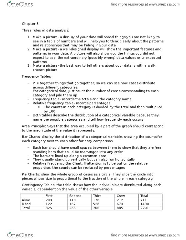
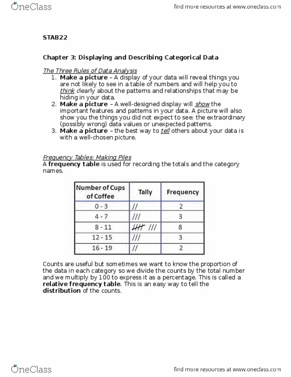
The three rules of data analysis: make a picture. A well designed display will show the important features and patterns in your data. A picture will also show you the things you did expect to see such as the extraordinary (possibly wrong) data values or unexpected patterns: make a picture. The best way to tell others about your data is with a well chosen picture. In this case, we can organize these cases in a frequency tables. Frequency tables we just count the number of case corresponding to each category and put them in the table. E. g. for tick class, these are first , second , third , and crew . If the number of cases in several categories is relatively small, you can put them together into one category labelled other . Counts are useful, but sometimes we want to know the fraction or proportion of the data in each category which can be called relative frequency table.