GBDA101 Chapter Notes - Chapter 7: Cap Height, Sans-Serif, Kerning

2 Aug 2016
School
Department
Course
Professor
Document Summary
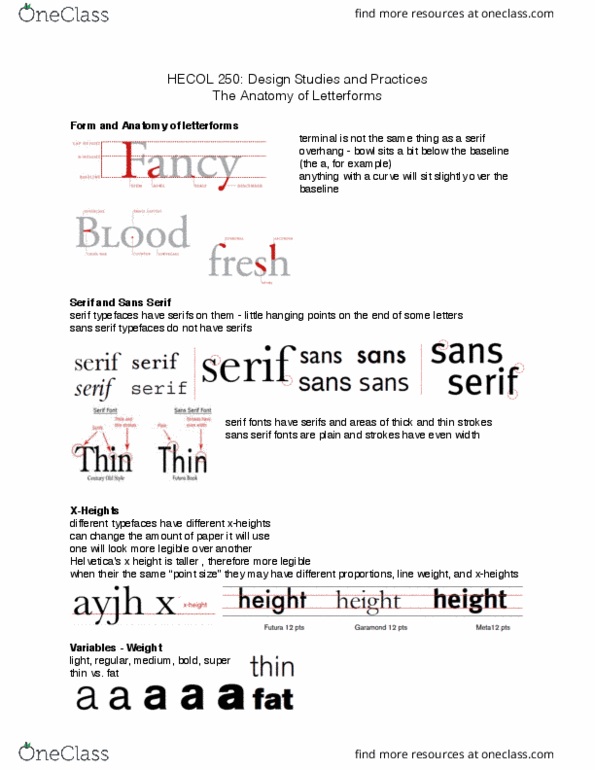
Classification: old style, transitional, modern, slab serif (can"t find example font, sans serif, display, script. Style, weight, width: style: regular vs italic vs bold. Achieves contrast etc: weight: lightness/darkness of letterforms. X-height and cap height: x-height: height of lowercase letters without ascenders/descenders. Ascenders rise from the baseline above the x-height to the cap height. Look at the lower case x to determine the x-height: cap height: height of capital letters. Measured from the baseline (where the letters sit) to the capline (where the line at the top of the uppercase letters sit) Counters: white spaces located inside/around letterforms, affect legibility and density, spaces between letters. Small capitals: complete sets of uppercase letters hat are the same height as the lowercase letters, erase unwanted emphasis that full capital letters give. Line and non-lining figures: typefaces have 1-2 set of numerals, lining figures: same height and width as full capitals.