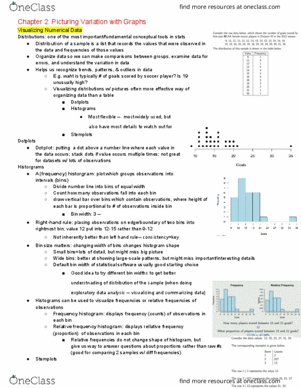
STATS 10 Lecture Notes - Lecture 2: Pareto Chart, Bar Chart, Categorical Variable


Chapter 2: Picturing Variation with Graphs
April 4, 9
VISUALIZING DATA
● How do we visualize data? → by making a picture
○ organizing the data in the form of a chart / graph / plot can be an effective way of
looking at trends, patterns, outliers, and other relationships
○ visualizing data can also help us to make predictions and conclusions
CATEGORICAL VARIABLES
● bar charts
: display the counts or frequencies of each category next to each other for
easy comparison
○ used for categorical variables
○ typically, the order of the bars does not matter
○relative frequency bar charts
: display relative proportions of
each category (in percentages, rather than in counts)
■ frequency = how many times a value occurred in the
data
○Pareto chart
: a bar chart that orders the categories from
largest to smallest frequency
● pie charts
: display data counts as percentages of subjects in each
category
○ each piece = represents a category of the variable
■ area of the piece = proportional to the relative
frequency of that category
○ even though pie charts are popular, they are not preferred
among statisticians (as it is difficult to visually compare the
categories, without written percentages)
● Descriptions of Categorical Distributions
○ mode
: the category that occurs the most or the category with
the highest frequency
○ variability
: refers to the distribution of counts among the
different categories
■ more categories there are → more variability there is
Document Summary
How do we visualize data? by making a picture. Organizing the data in the form of a chart / graph / plot can be an effective way of looking at trends, patterns, outliers, and other relationships. Visualizing data can also help us to make predictions and conclusions. Bar charts : display the counts or frequencies of each category next to each other for easy comparison. Typically, the order of the bars does not matter. Relative frequency bar charts : display relative proportions of. Frequency = how many times a value occurred in the each category (in percentages, rather than in counts) data. Pareto chart : a bar chart that orders the categories from largest to smallest frequency. Pie charts : display data counts as percentages of subjects in each category. Each piece = represents a category of the variable. Area of the piece = proportional to the relative frequency of that category.