STATS 10 Lecture Notes - Lecture 3: Exploratory Data Analysis, List Of Statistical Packages, Pareto Chart


Chapter 2: Picturing Variation with Graphs
Visualizing Numerical Data
Distributions: one of the most important/fundamental conceptual tools in stats
● Distribution of a sample is a list that records the values that were observed in
the data and frequencies of those values
● Organize data so we can make comparisons between groups, examine data for
errors, and understand the variation in data
● Helps us recognize trends, patterns, & outliers in data
○ E.g. waht is typically # of goals scored by soccer player? Is 19
unusually high?
○ Visualizing distributions w/ pictures often more effective way of
organizing data than a table
■ Dotplots
■ Histograms
● Most flexible → most widely used, but
also have most details to watch out for
■ Stemplots
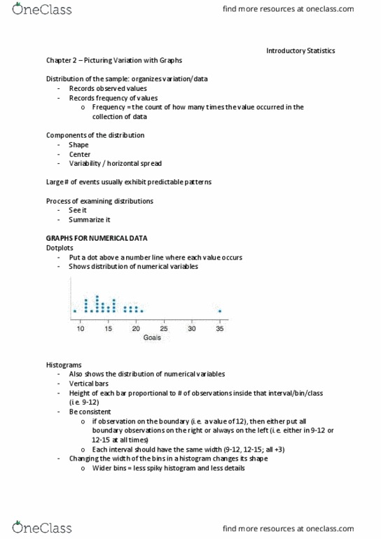
Dotplots
● Dotplot: putting a dot above a number line where each value in
the data occurs; stack dots if value occurs multiple times; not great
for datasets w/ lots of observations
Historgrams
● A (frequency) historgram: plot which groups observations into
intervals (bins)
○ Divide number line into bins of equal width
○ Count how many observations fall into each bin
○ draw vertical bar over bins which contain observations, where height of
each bar is proportiional to # of observations inside bin
■ Bin width: 3 →
● Right-hand rule: placing observations on edge/boundary of two bins into
rightmost bin; value 12 put into 12-15 rather than 9-12
○ Not inherently better than left hand rule→ consistency=key
● Bin size matters: changing width of bins changes histogram shape
○ Small bins=lots of detail, but might miss big picture
○ Wide bins: better at showing large-scale patterns, but might miss important/interesting details
○ Default bin width of statistical software usually good starting choice
■ Good idea to try different bin widths to get better
understnading of distribution of the sample (when doing
exploratory data analysis → visualizing and summarizing data)
● Histograms can be used to visualize frequencies or relative frequencies of
observations
○ Frequency histogram: displays frequency (counts) of observations in
each bin
○ Relative frequency histogram: displays rellative frequency
(proportion) of observations in each bin
■ Relative frequencies do not change shape of histogram, but
give us way to answer questions about proportions rather than raw #s
(good for comparing 2 samples w/ diff frequencies)
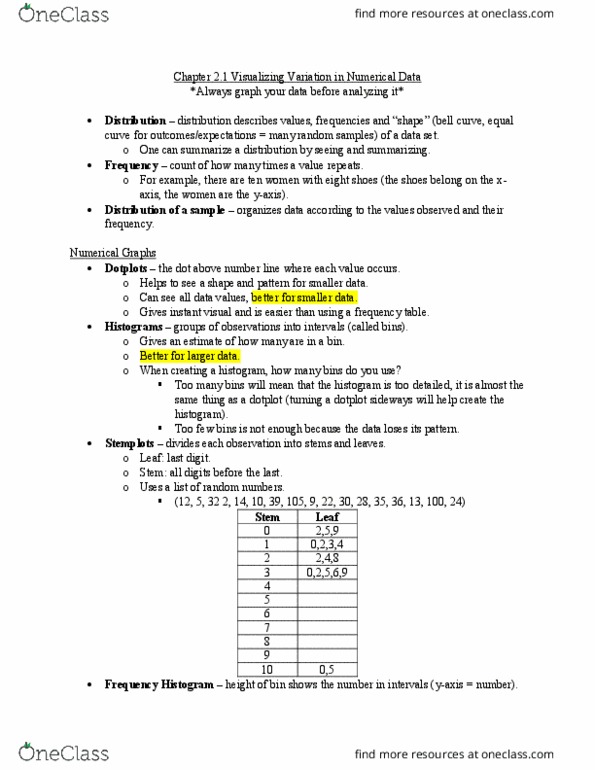
● Stemplots
find more resources at oneclass.com
find more resources at oneclass.com
Document Summary
Distributions: one of the most important/fundamental conceptual tools in stats. Distribution of a sample is a list that records the values that were observed in the data and frequencies of those values. Organize data so we can make comparisons between groups, examine data for errors, and understand the variation in data. Helps us recognize trends, patterns, & outliers in data. Visualizing distributions w/ pictures often more effective way of organizing data than a table. Most flexible most widely used, but also have most details to watch out for. Dotplot: putting a dot above a number line where each value in the data occurs; stack dots if value occurs multiple times; not great for datasets w/ lots of observations. A (frequency) historgram: plot which groups observations into intervals (bins) Divide number line into bins of equal width. Count how many observations fall into each bin.