STAT 1430 Lecture Notes - Lecture 5: Scatter Plot, Simple Linear Regression, Pearson Product-Moment Correlation Coefficient

22 Jan 2019
School
Department
Course
Professor


STAT 1430 verified notes
5/30View all
4
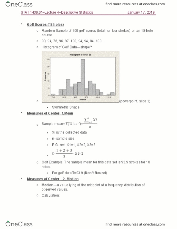
STAT 1430 Lecture Notes - Lecture 4: Frequency Distribution, Histogram, Standard Deviation
5
STAT 1430 Lecture Notes - Lecture 5: Scatter Plot, Simple Linear Regression, Pearson Product-Moment Correlation Coefficient
6
STAT 1430 Lecture Notes - Lecture 6: Pearson Product-Moment Correlation Coefficient, Descriptive Statistics, Regression Analysis
Document Summary
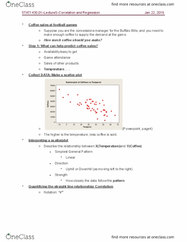
Step 1: what can help predict coffee sales: availability/easy to get, game attendance, sales of other products, temperature . Collect data: make a scatter plot (powerpoint, page4: the higher is the temperature, less coffee is sold. Interpreting a scatterplot: describe the relationship between x(temperature)and y(coffee, simplest general pattern. Linear: direction, uphill or downhill (as moving left to the right, strength, how closely the data follow the pattern, quantifying the straight line relationship: correlation, notation: r . N i=1 (xi x )(yi y) n 1. N i=1 (xi x )(yi y) (xi x )2 (yi y)2 (don"t use for manual calculation: interpretation, hour x and y move together compared separately (focusing on linear relationship or not) Interpreting correlation: -1 r 1, +1 = perfect uphill linear relationship, -1 = perfect downhill linear relationship. Example: target vs. walmart: correlations: target, walmart, pearson correlation of target and walmart = 0. 659 =r.