S W 318 Chapter Notes - Chapter 3: Bar Chart, Ordinal Data, Line Graph

Document Summary
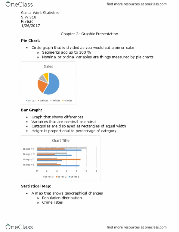
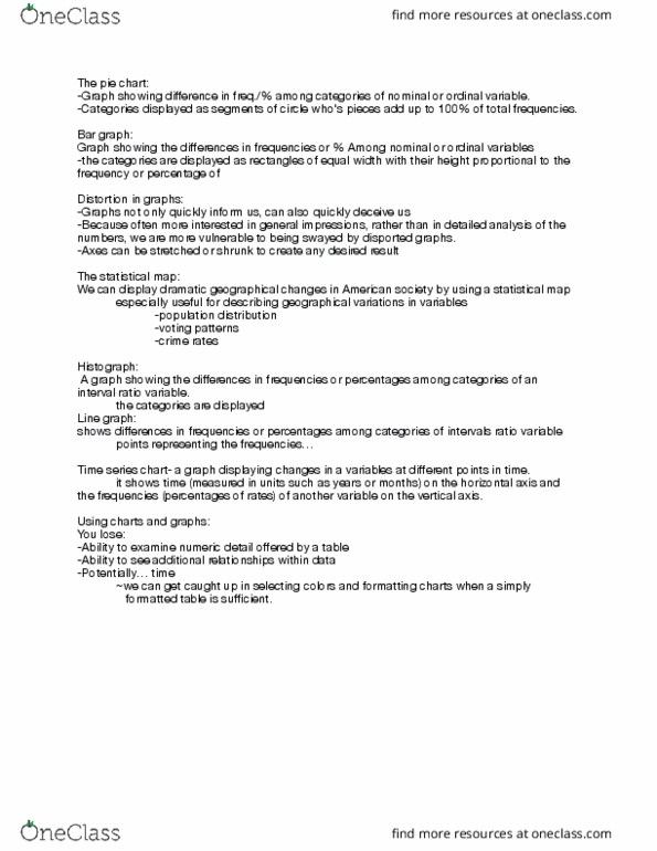
Often times we are more interest in the general impression than in detailed analyses of the numbers. Axes can be shrunk or stretched in order to create a desired result in the graph. Ability to examine numeric detail offered by a table. Reach readers who may otherwise be intimidated. Bar graph a graph showing the differences in frequencies or percentages among the categories of a nominal or an ordinal variable. The categories are displayed as rectangles of equal width with their height proportional to the frequency of percentage of the category. Histogram a graph showing the differences in frequencies or percentages among the categories of an interval-ratio variable. The categories are displayed as continuous bars, the width proportional to the width of the category and height it proportional to the frequency or percentage of that category. Line graph a graph showing the differences in frequencies or percentages among categories of an interval-ration variable.