BUAD 310g Chapter Notes - Chapter 12: Scatter Plot, Random Variable, Total Variation

14 Dec 2016
School
Department
Course
Professor
Document Summary
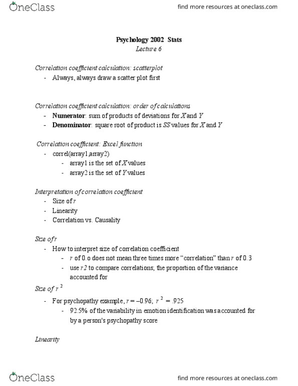
Describe and summarize relationships between variables (instead of single-variable analysis) Analysis of bivariate data usually begins with a scatter plot. Diagram provides analysis of the strength of the relationship of association between two variables. Look at scatter plot to get initial idea of relationship between two random variables. Used to quantify the strength of a relationship. *when r is near zero, there is little or no relationship between x and y. *r value near +1 indicates strong positive relationship. *r value near -1 indicates strong negative relationship. To calculate sample correlation coefficient use excel function =correl(array1, array2) Correlation coefficient only measures the degree of linear relationship between x and y. Sample correlation coefficient r is an estimate for the population correlation coefficient . After calculating t statistic, use excel function to find out p value =t. dist. 2t. In large sample, small correlations may be significant. Even if scatter plot shows little amount of linearity.