Textbook Guide Statistical Sciences: Line Graph, Pie Chart, Frequency Distribution


23
STA130H1 Full Course Notes
Verified Note
23 documents
Document Summary
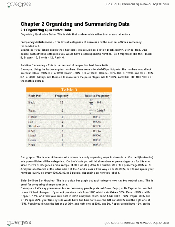
Organizing qualitative data - this is data that is observable rather than measurable data. Frequency distributions - this lists all categories of answers and the number of times somebody responded to it. Example: if you asked people their hair color, you would see a list of: black, And beside each of those categories you would have a corresponding number. So it might look like this: black - 8, brown - 16, Relative frequency - this is the percent of people that had those traits. Example: using the last example"s numbers, there were a total of 40 participants, the numbers would look like this: black - 20%, 0. 2, or 8/40, brown. Always add them up to make sure the percentages add to 100%, so. 20+40+30+10 = 100, so the math is correct. Bar graph this is one of the easiest and most visually appealing ways to show data. On the x(horizontal) axis you will label all the categories.