Textbook Guide Statistical Sciences: Scatter Plot, Mathematical Diagram, Dependent And Independent Variables


23
STA130H1 Full Course Notes
Verified Note
23 documents
Document Summary
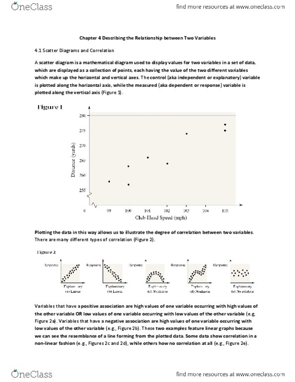
The control (aka independent or explanatory) variable is plotted along the horizontal axis, while the measured (aka dependent or response) variable is plotted along the vertical axis (figure 1). Plotting the data in this way allows us to illustrate the degree of correlation between two variables. There are many different types of correlation (figure 2). Variables that have a positive association are high values of one variable occurring with high values of the other variable or low values of one variable occurring with low values of the other variable (e. g, figure 2a). Variables that have a negative association are high values of one variable occurring with low values of the other variable (e. g. , figure 2b). These two examples feature linear graphs because we can see the resemblance of a line forming from the plotted data. Some data show correlation in a non- linear fashion (e. g. , figures 2c and 2d), while others how no correlation at all (e. g. , figure 2e).