STAT151 Chapter Notes - Chapter 6: Confounding, Scatter Plot, Dependent And Independent Variables

10 Feb 2016
School
Department
Course
Professor


4
STAT151 Full Course Notes
Verified Note
4 documents
Document Summary
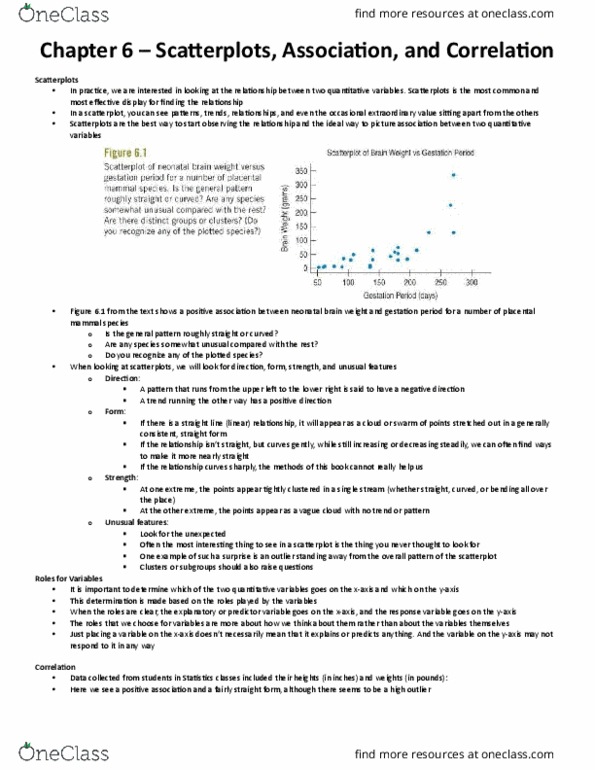
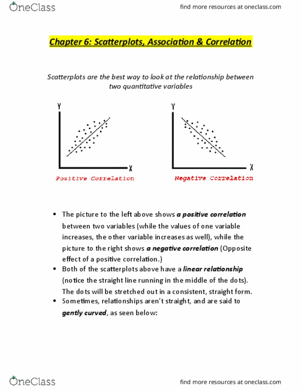
When we plot one quantitative variable versus another quantitative variable, the resultant graph is called a. This is the best graph to observe the relationship between two quantitative variables; ideal ways to picture such associations scatterplot. A pattern that runs from the upper left to the lower right is said to be negative. A pattern that runs from the lower left to the upper right to said to be positive. If there is a straight-line relationship, it will appear as a swarm of points stretched out in a generally consistent, straight form, this association is linear. If the relationship isn"t completely straight, we can find a few ways to make it straighter. If the relationship curves very sharply, then multiple regressions are needed to make it straighter. A common example of unexpected is an outlier that is far away from the general pattern of the scatterplot.