CCT360H5 Study Guide - Final Guide: Grid Systems Corporation, Media Queries, Affix

21 Jun 2018
School
Department
Course
Professor

CCT360H5F - INTERMEDIATE WEB DESIGN (SUMMER 2018)
University of Toronto Mississauga | Sheridan College
Dan Peltier
Jonathan Ho
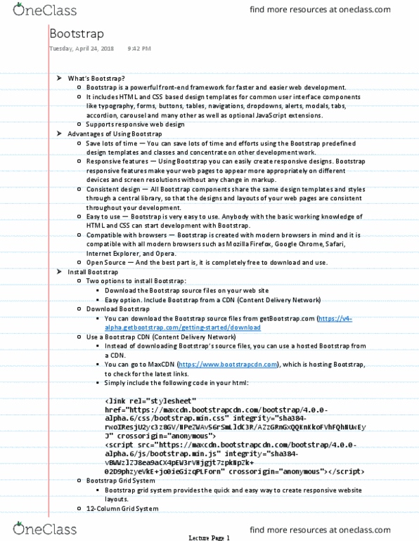
Bootstrap
What is Bootstrap?
●Free front-end framework for faster and easier web development
●Includes HTML and CSS based design templates for typography, forms, buttons, tables,
javascript plugins and more
●Gives you the ability to easily create responsive designs
●Helps you write HTML and CSS code for a webpage easily through built-in codes/plugins
Bootstrap Layout
Components and options used in bootstrap include wrapping containers, grid systems, flexible media
objects and responsive utility classes. Bootstrap's grid system is responsive, and the columns will
rearrange depending on the screen size.
Some Bootstrap grid system rules:
●Rows must be placed within a .container (fixed-width) or .container-fluid (full-width) for
proper alignment and padding
●Use rows to create horizontal groups of columns
●Content is placed within columns, and only columns may be immediate child of rows
●Predefined classes like .row and .col-sm-4 are available for quickly making grid layouts
●Columns create gutters (gaps between column content) via padding. That padding is offset in
rows for the first and last column via negative margin on .rows
●Grid columns are created by specifying the number of 12 available columns you wish to
span. For example, three equal columns would use three .col-sm-4
●Column widths are in percentage, so they are always fluid and sized relative to their parent
Responsive Media Queries
// Extra Small Devices (Less than 576px) (Not in Bootstrap 3)
@media (max-width: 576px) { ... }
// Small devices (landscape phones, less than 768px) (ExtSmall in Bootstrap 3)
@media (max-width: 768px) { ... }
// Medium devices (tablets, less than 992px) (Small in Bootstrap 3)
@media (max-width: 992px) { ... }
// Large devices (desktops, less than 1200px) (Medium in Bootstrap 3)
@media (max-width: 1200px) { ... }
// Extra Large devices (desktops, less than 1200px) (Large in Bootstrap 3)
@media (min-width: 1200px) { ... }
z-index: Used to properly layer elements
Document Summary
Free front-end framework for faster and easier web development. Includes html and css based design templates for typography, forms, buttons, tables, javascript plugins and more. Gives you the ability to easily create responsive designs. Helps you write html and css code for a webpage easily through built-in codes/plugins. Components and options used in bootstrap include wrapping containers, grid systems, flexible media objects and responsive utility classes. Bootstrap"s grid system is responsive, and the columns will rearrange depending on the screen size. Some bootstrap grid system rules: proper alignment and padding. Rows must be placed within a . container (fixed-width) or . container-fluid (full-width) for. Use rows to create horizontal groups of columns. Content is placed within columns, and only columns may be immediate child of rows. Predefined classes like . row and . col-sm-4 are available for quickly making grid layouts. Columns create gutters (gaps between column content) via padding.