1
answer
0
watching
102
views
2 Aug 2018
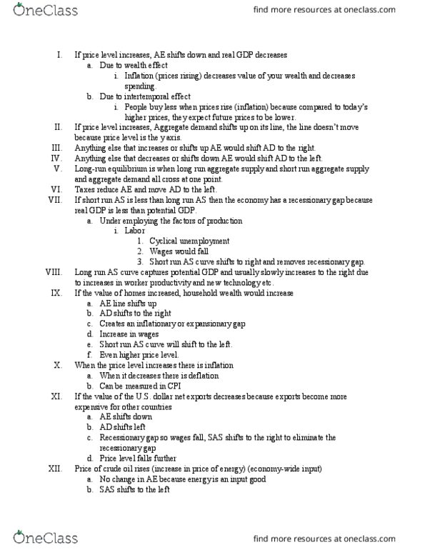
Lise the figure below to wiswer the following questions. Price level Price level SAS SAS ADO Real GDP 0 Real GDP Price level Price level SAS SAS AD Real GDP Real GDP Figure 26.1.1 8) Refer to Figure 26.1.1. Which graph illustrates what happens when factor prices rise? A) (a) B) (b) (c) D) (d) E) (a) and (b)
Lise the figure below to wiswer the following questions. Price level Price level SAS SAS ADO Real GDP 0 Real GDP Price level Price level SAS SAS AD Real GDP Real GDP Figure 26.1.1 8) Refer to Figure 26.1.1. Which graph illustrates what happens when factor prices rise? A) (a) B) (b) (c) D) (d) E) (a) and (b)

Patrina SchowalterLv2
5 Aug 2018