PSY201H1 Lecture Notes - Lecture 3: Misleading Graph, Percentile Rank, Level Of Measurement

Document Summary
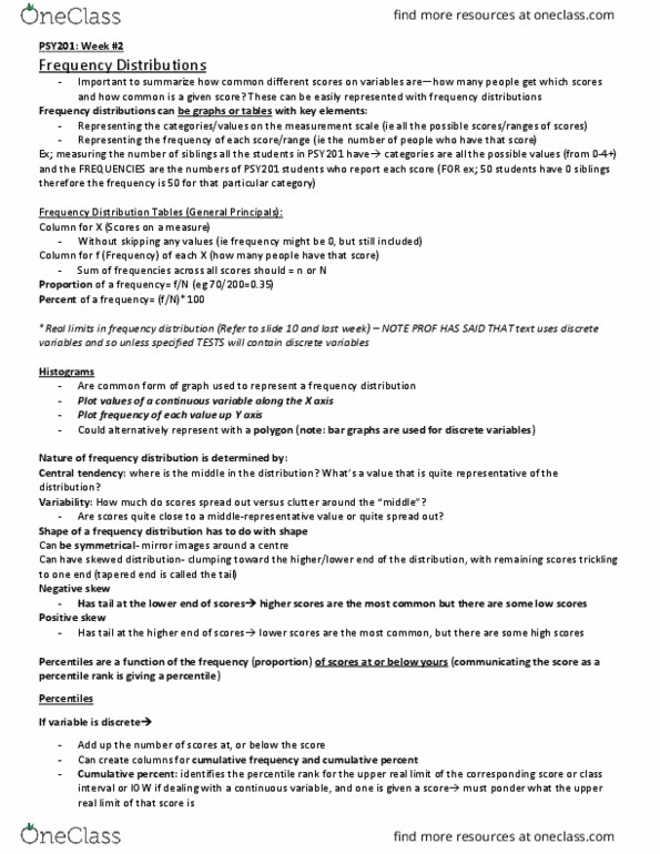
Frequency distributions: tell you how many scores are located in each category of measurements; can be in any time of scale. May be structured as either a table or a graph. In either case, the information presented is the same: set of categories (x): in the original measurement scale, frequency (f): or number of individuals in each category. In an ordinal scale you would want to put the smallest numbers at the bottom, and larger at the top. Note: if we add up all our frequencies, it should be the total number of participants in the data set. Proportions: fraction of the total group that is associated with each score (also called relative frequency) p= f. Often used for presenting results from interval/ratio scales as well. You want to include all sets of categories even if the frequency is 0.