CCT260H5 Lecture Notes - Lecture 9: Media Queries, Responsive Web Design

7 Jun 2018
School
Department
Course
Professor


Class 9
Responsive Web Design
• Many different kinds of screens, from phones to desktop, portrait and landscape, Apple
watches, etc.
o Ideally your site should work on all of them
o Good responsive designs adapt to different media types – and CSS can help adapt
content and layout on the fly
• Viewports and Grids
o Setting viewport tells browser to scale to full width at basic zoom levels
o Instead of setting width elements, look at grid structure -12 or 16 – column grid layout
allows for flexible positioning that scales at different widths
o Box-sizing to standardize box properties
o Col-# structure to define 12 column width, all floating left
▪ Just be sure all columns add to 100%
o Viewports:
▪ Using <meta> tags in the <head>
o Responsive grid-view:
▪ Ex. 100% over 12 columns = 8.33% each
• Column 1 = 8.33
• Column 2 = 16.66
• Column 3 = 25, etc
o Width adds up each time (that much of the screen)
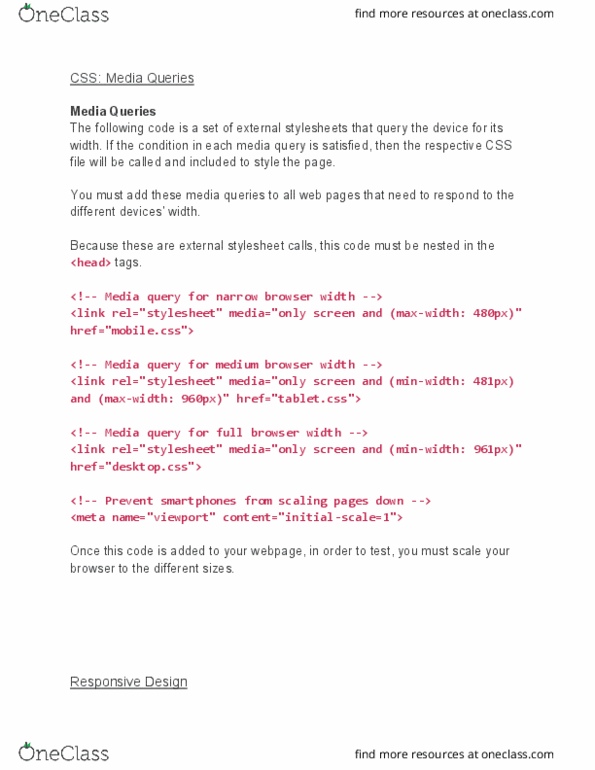
• Media Queries
o Instructions to tell browser to detect device and orientation
▪ Common pixel counts
o Can define specific tag descriptions at various resolutions
o Can also call up totally separate CSS files – allowing for completely different and radical
changes on various devices
▪ Consider content as guide
o Deciding what media is and changing instructions based on this
▪ Using certain HTML on certain spaces (ex. hiding a photo on a smaller screen)
▪ Like if.., the.. stateets
• Mobile First Design
o Much development happens on expansive screens – but most content consumption
happens on the go and on mobile screens
o Design for mobile first – has bigger constraints and for many user personas; most
common form of interaction
o Bootstrap will be looked at more in 360/460 – but a good responsive, mobile-friendly
framework to leverage
Lab 7
find more resources at oneclass.com
find more resources at oneclass.com