ENVS178 Lecture Notes - Lecture 3: Pus, Sustainable Energy, Ogive

4 Apr 2016
School
Department
Course
Professor
Document Summary
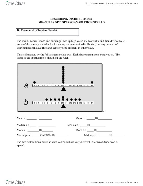
De veaux et al. , chapters 3 and 4. As a starting point, it makes sense to list, summarize or chart data before doing any calculations. A visual inspection can help you to choose the most appropriate techniques. To illustrate some of the most common techniques for displaying distributions, i will use the following data set of 30 observations of daily maximum temperature (degrees c. ). You should be asking questions about how the data were collected, for example: Viewing the data as a time series (line chart created in excel) Listing the data as an ordered array: i have re-ordered the observations in ascending order. Stem and leaf displays (or stemplots) give an overall impression of the frequency distribution, i. e. the frequency with which different values occur. Stems: as many digits as needed to represent data. Leaves: usually 1 digit only (need to be consistent with number of digits).