POLS 3650 Lecture Notes - Lecture 17: Contingency Table, Point Estimation, Box Plot

17 Mar 2017
School
Department
Course
Professor
Document Summary
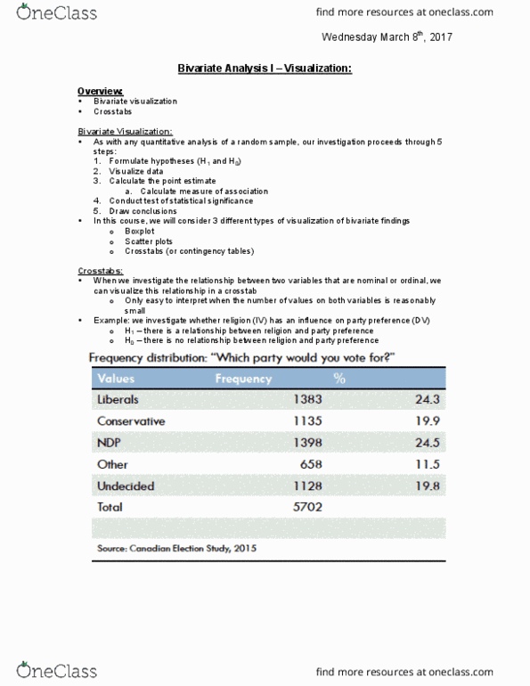
As with any quantitative analysis of a random sample, our investigation proceeds through five steps: Calculate point estimate: calculate measure of association. In this course, we will consider three different types of visualization of bivariate findings: When we investigate the relationship between two variables that are nominal or ordinal, we can visualize this relationship in a crosstab. Only easy to interpret when the number of values on both variables is reasonably small. Example: we investigate whether religion (iv) has an influence on party preference (dv) H1: there is a relationship between religion and party preference. H0: there is no relationship between religion and party preference. Dependent variable goes in the rows and the independent variable goes in columns. Crosstabs visualize the relationship between two variables that are either nominal or ordinal. We can only interpret crosstabs when the number of values on each variable is not too large. Calculate percentages across columns, compare percentages across rows.