6540 Lecture Notes - Lecture 2: Interquartile Range, Unimodality, Quartile

30 Jul 2018
School
Department
Course
Professor
Document Summary
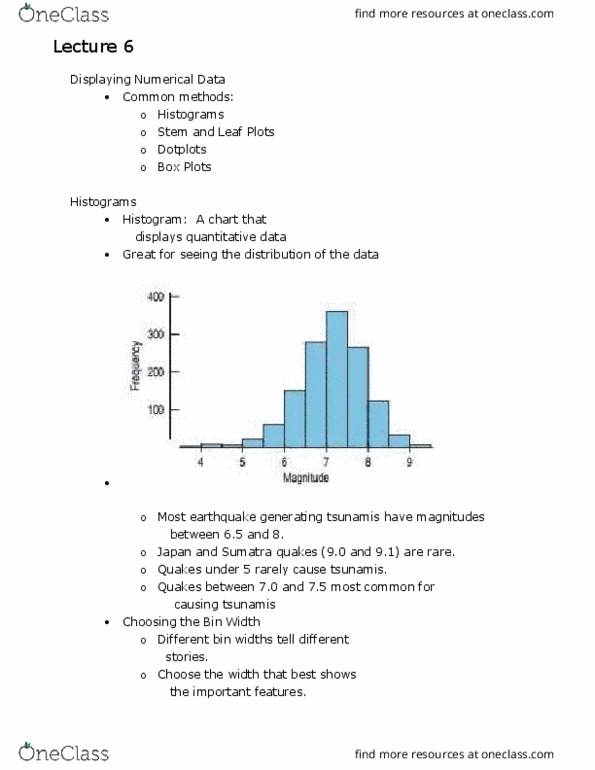
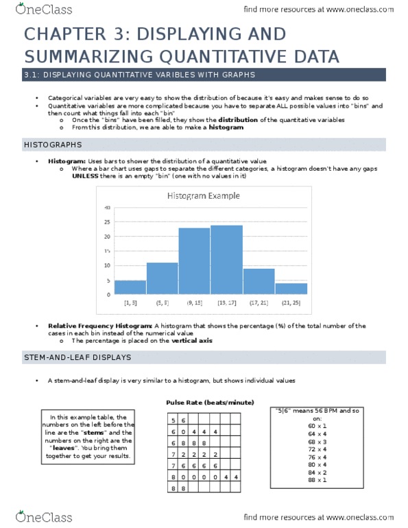
Histogram: most important chart for quantitative data, smaller bins for more data, difference between bar graph = no gaps except for missing information. Y axis is different to regular histogram as it is displayed as a percentage. The vertical axis represents the relative frequency (frequency divided by the total). The horizontal axis is the same the horizontal axis for the frequency histogram. The shape of the relative as frequency histogram is the same as the frequency histogram. Only the scale of the y-axis is different. Multiple peaks do not need to be exactly the same value to be classified as uniform or symmetric. Uniform distribution: u(cid:374)ifo(cid:396)(cid:373) dist(cid:396)i(cid:271)utio(cid:374): all the (cid:271)i(cid:374)s ha(cid:448)e the sa(cid:373)e f(cid:396)e(cid:395)ue(cid:374)(cid:272)(cid:455), o(cid:396) at least (cid:272)lose to the sa(cid:373)e frequency, the histog(cid:396)a(cid:373) fo(cid:396) a u(cid:374)ifo(cid:396)(cid:373) dist(cid:396)i(cid:271)utio(cid:374) (cid:449)ill (cid:271)e flat. Symmetry: the histog(cid:396)a(cid:373) fo(cid:396) a s(cid:455)(cid:373)(cid:373)et(cid:396)i(cid:272) dist(cid:396)i(cid:271)utio(cid:374) (cid:449)ill look the sa(cid:373)e o(cid:374) the left a(cid:374)d the right of its center.