BUSS1020 Chapter Notes - Chapter 2-3: Standard Deviation, Kurtosis, Box Plot

28 May 2018
School
Department
Course
Professor

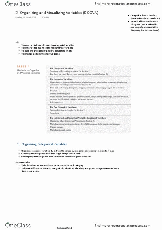
CHAPTER 2: ORGANISING AND VISUALISING VARIABLES
ORGANISING
VISUALISING
Categorical (1 variable)
Summary table
- Bar chart
- Pareto chart
- Pie chart
Categorical (2 variables)
Contingency table
Side-by-side bar chart
Numerical (1 variable)
- Ordered array
- Frequency distribution
- Cumulative distributions
- Stem and leaf plot
- Histogram
- Polygon
- Cumulative Percentage Polygon (Ogive)
Numerical (2 variables)
^^^^^
- Scatter plot
- Time series plot
Numerical variables (2+)
- Pivot table
ORGANISING CATEGORICAL VARIABLES:
• Summary Table: tallies values as frequencies / % for each category
• Contingency Table: cross-tabulates values of 2+ categorical variables à study of patterns
VISUALISING CATEGORICAL VARIABLES:
• Bar Chart: each bar represents tallies for a single category, length represents % à GAP à + Side-by-side bar chart
• Pareto Chart: vertical bar chart (descending frequency) + cumulative % line (at midpoint) à separates vital few from trivial many
• Pie Chart: one slice per category, size represents % per category
ORGANISING NUMERICAL VARIABLES:
• Ordered Array: ranked smallest to largest à identify outliers, range
• Frequency Distribution: values arranged into numerically ordered classes à number of groups + width needs to be chosen
o Width of group = (highest value – lowest value) / number of classes
o Sometimes classes are identified by class midpoints
o Otherwise done with relative frequency = proportion of total each class represents
• Cumulative Distributions
VISUALISING NUMERICAL VARIABLES:
• Stem and Leaf Display: leaves generally represent the last significant digit of each value
• Histogram: vertical bar chart, plot class midpoints on x-axis + % on y-axis à NO GAP
• Percentage Polygon: midpoints represent class data, plots % along x-axis
• Cumulative Percentage Polygon (Ogive): plot cumulative % along y-axis à uses lower boundary of interval
VISUALISING TWO NUMERICAL VARIABLES:
• Scatter Plot: examine relationships b/w 2 numerical variables à pos/neg relationships, weak/none/strong
• Time-Series Plot: visualise patterns in numerical data over time
VISUALISING MANY NUMERICAL VARIABLES:
• Pivot Table: interactive, can change the arrangement/formatting of variables
CHALLENGES IN ORGANISING AND VISUALISING VARIABLES:
• Obscuring data: information overload, ordering/colouring of parts of a chart etc.
• Creating false impressions: selective summarisation, different scales axes in charts visualising the same data
• Chart junk: obscuring data, false impression
CHAPTER 3: NUMERICAL DESCRIPTIVE MEASURES
CENTRAL TENDENCY:
• The extent to which the values of a numerical variable group around a central value
o Sample Mean: most common measure, all values play equal role
§ à sum of values / number of values
§ Affected by extreme values
o Sample Median: middle value in ordered array à NOT affected by extreme values
§
§ Odd = middle value, Even = average of two middle values
o Sample Mode: most frequently observed value à NOT affected by extreme values, none or multiple
o Geometric Mean: measure the rate of change of a variable over time
§
§ Geometric Mean Rate of Return:
• Status of investment over time
dataorderedtheinposition
2
1n
positionMedian +
=
n/1
n21
G)XXX(X ´´´=!
1)]R1()R1()R1[(Rn/1
n21
G-+´´+´+= !
Document Summary
Summary table: tallies values as frequencies / % for each category. Contingency table: cross-tabulates values of 2+ categorical variables study of patterns. Bar chart: each bar represents tallies for a single category, length represents % gap + side-by-side bar chart. Pareto chart: vertical bar chart (descending frequency) + cumulative % line (at midpoint) separates vital few from trivial many. Pie chart: one slice per category, size represents % per category. Ordered array: ranked smallest to largest identify outliers, range. Frequency distribution: values arranged into numerically ordered classes number of groups + width needs to be chosen: width of group = (highest value lowest value) / number of classes. Otherwise done with relative frequency = proportion of total each class represents. Stem and leaf display: leaves generally represent the last significant digit of each value. Histogram: vertical bar chart, plot class midpoints on x-axis + % on y-axis no gap. Percentage polygon: midpoints represent class data, plots % along x-axis.