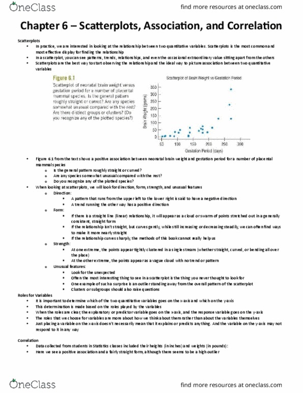
1
answer
2
watching
212
views

123Lv1
27 Apr 2023
Using the graph below, create a scatter plot comparing the number of minutes played to the number of points scored. Number of minutes played should go on the x-axis and points scored should be plotted on the y axis After completing your scatterplot, please find the line of best-fit and graph it in the coordinate plane
Using the graph below, create a scatter plot comparing the number of minutes played to the number of points scored. Number of minutes played should go on the x-axis and points scored should be plotted on the y axis After completing your scatterplot, please find the line of best-fit and graph it in the coordinate plane