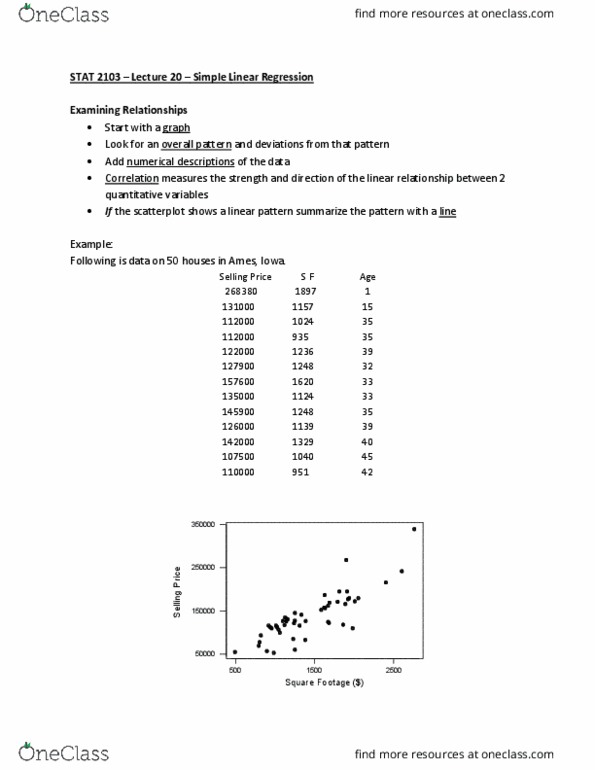
4
answers
1
watching
182
views

123Lv1
6 Apr 2023
Data 200000,200000,150000,150000,100000,100000,75000,75000,50000,50000
Now, create a histogram of your elatal Once you have created your PowerPolnt insert an image into your electronic notebook or use Stapplet (Examples here)
First, organize your data and create a relative frequency table. Feel free to use the categories below or change the category widths to better match your data.
Salary
Frequency
Relative Frequency
20 - 29
30 - 39
40 - 49
50 - 59
60 - 69
70 - 79
80 - 89
90 - 99
100 - 109
110 - 119
120 - 129
130 - 139
140 - 149
150 - 159
160 - 169
170 - 179
180 - 189
190 - 199
Total
10
100%
Why is it useful to group data values?
Data 200000,200000,150000,150000,100000,100000,75000,75000,50000,50000
Now, create a histogram of your elatal Once you have created your PowerPolnt insert an image into your electronic notebook or use Stapplet (Examples here)
First, organize your data and create a relative frequency table. Feel free to use the categories below or change the category widths to better match your data.
| Salary | Frequency | Relative Frequency |
| 20 - 29 | ||
| 30 - 39 | ||
| 40 - 49 | ||
| 50 - 59 | ||
| 60 - 69 | ||
| 70 - 79 | ||
| 80 - 89 | ||
| 90 - 99 | ||
| 100 - 109 |
| 110 - 119 | ||
| 120 - 129 | ||
| 130 - 139 | ||
| 140 - 149 | ||
| 150 - 159 | ||
| 160 - 169 | ||
| 170 - 179 | ||
| 180 - 189 | ||
| 190 - 199 | ||
| Total | 10 | 100% |
Why is it useful to group data values?

abhisheksinghLv10
1 Oct 2023


Read by 1 person

Related textbook solutions
Related questions


The probability distribution for the daily sales at michael's co. is given below.
| Sales | Probability |
| $40,000 | 0.1 |
| $50,000 | 0.4 |
| $60,000 | 0.3 |
| $70,000 | 0.2 |
What is the probability of having sales for at least $50,000?