STT 212 Lecture Notes - Lecture 10: Scatter Plot, Statistical Hypothesis Testing

16 Apr 2019
School
Department
Course
Professor
Document Summary
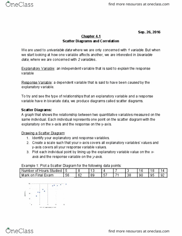
A scatter plot is a graph used to determine whether there is a relationship between paired data. In many real-life situations, scatter plots follow patterns that are approximately linear. If y tends to increase as x increases, then the paired data are said to be a positive correlation. If y tends to decrease as x increases, the paired data are said to be a negative correlation. If the points show no linear pattern, the paired data are said to have relatively no correlation. Clear (or deactivate) any entries in "y=" before you begin: enter the x data values in l1. Enter the y data values in l2, being careful that each x data value and its matching y data value are entered on the same horizontal line: activate the scatter plot. Press 2nd statplot and choose #1 plot 1. You will see the screen at the right.