PSYC 2300 Lecture Notes - Lecture 10: Focus Group, Normal Distribution, Dependent And Independent Variables

29 Apr 2016
School
Department
Course
Professor
Document Summary
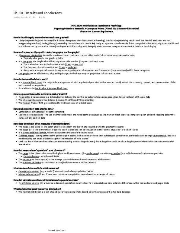
Frequency distribution: shows the number of times each score or other unit of ob- servation occurs in a set of data: usually takes the form of a chart, but can be tabular. Bar graphs: height of the solid bars represent the number (frequency) of focus group members who chose each option. Scale values are explicit on the horizontal axis (x): abscissa (another name for x axis) Number of members read from the vertical (y): ordinate (aka y axis0|) Bar graphs are useful for representing categories of responses and frequencies within those categories. Line graphs are a way of graphing changes in frequency of scores over time. Clear, precise technique for displaying and interpreting a batch of data. Graph-table hybrid; presents original numbers an gives an economical summary view of them. Example in book: stems are tens", leaves are ones". Back-to-back stem-and-leaf chart: adjoining stem-and-leaf chart; can compare more than 1 dependent variable and show variability/concentration.