PSYC 300A Lecture Notes - Lecture 5: Joint Probability Distribution, Scatter Plot, Squared Deviations From The Mean

8 Nov 2015
School
Department
Course
Professor
Document Summary
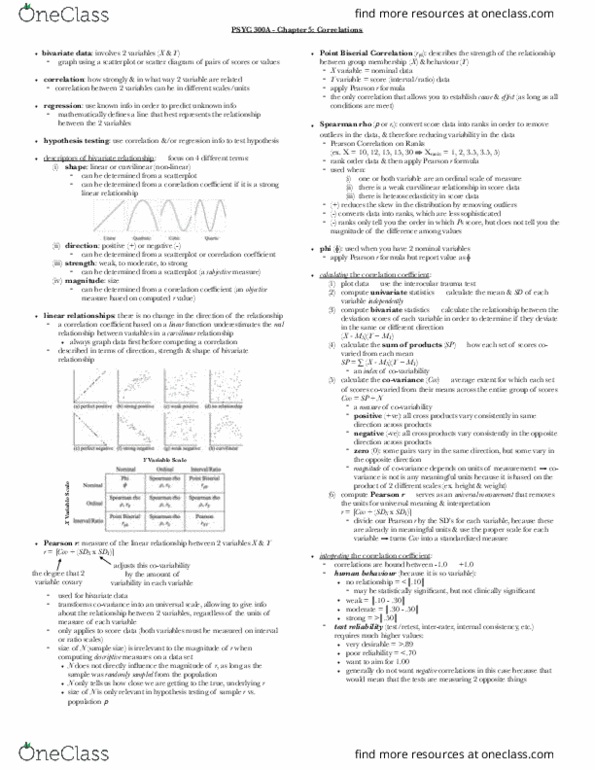
Note that if a curvilinear relationship is assumed to be a linear relationship, its correlation will be underestimated (relationship is in fact stronger than what we see): always keep in mind that we are looking to see how closely the points on the scatterplot hug the line of best fit, even if we are just viewing the graph, we determine the direction of the graph by imagining this line. ***note: this technique can be used to visually arrive at the answer with regards to the direction of the data: for example, if there are more ps that above the mean both on x and on y and there are also more points below the mean on both x and y (compared to the remaining two quadrants not mentioned), then yes, the data and the distribution have presented a positive relationship.